This project was done as a student project and has no connection with Warped Tour.
The current Warped Tour brand has remained practically the same for the last twenty years with slight variations from year to year. While the lineup has evolved beyond the strictly punk and ska bands featured during the nineties, the festival’s identity has not. In an effort to update, expand, and modernize the brand and all of it’s applications, a new identity system was created.
This new system is focused on the unique alternative culture and community that Warped Tour brings together every summer. In order to create a new look that wouldn’t alienate the dedicated bands and fans of the tour, many elements from the original branding were used as inspiration and reincorporated.
Logo
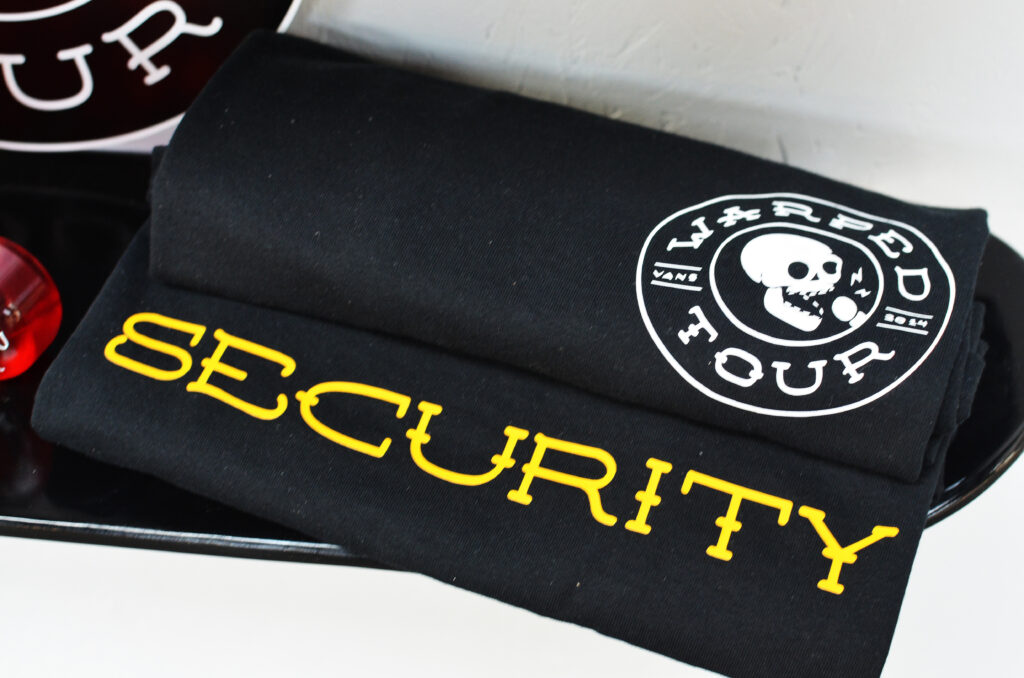
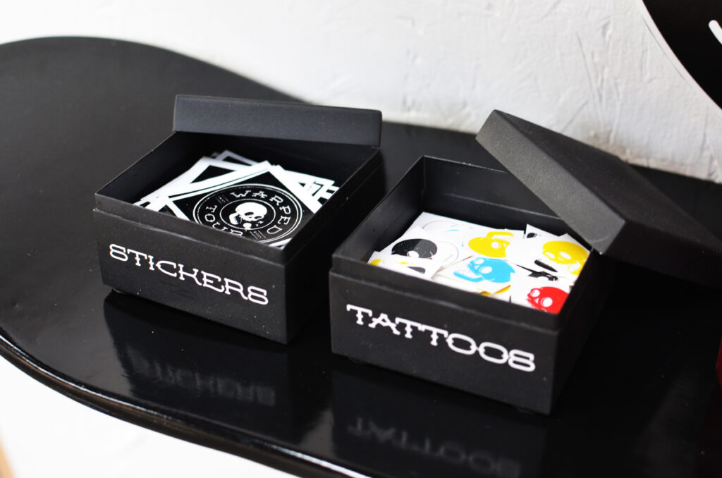
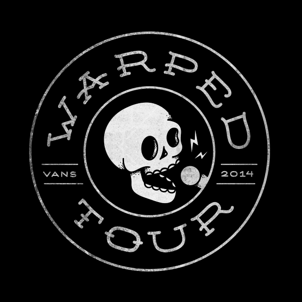
The new logo mark is embedded with several layers of symbolism. At the center of the mark, a singing skull was used to reference the heavy use of skulls and skeletons in the branding in previous years. Tattoo inspired typography represents the alternative nature of the festival, and the personal style of the artists and attendees who often have several tattoos of their own.
The overall shape of the mark has two meanings. First, it echoes the shape and coloring of a vinyl record, an item usually purchased by passionate music lovers who have an appreciation for tradition and quality. Second, it echoes the shape of a bus tire to reference one of the most unique aspects of Warped Tour – the fact that it is not a one day festival but a three month long traveling tour that stops at over fifty venues around the world.
Color & Typography
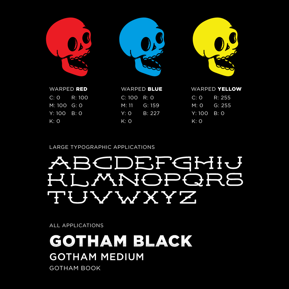
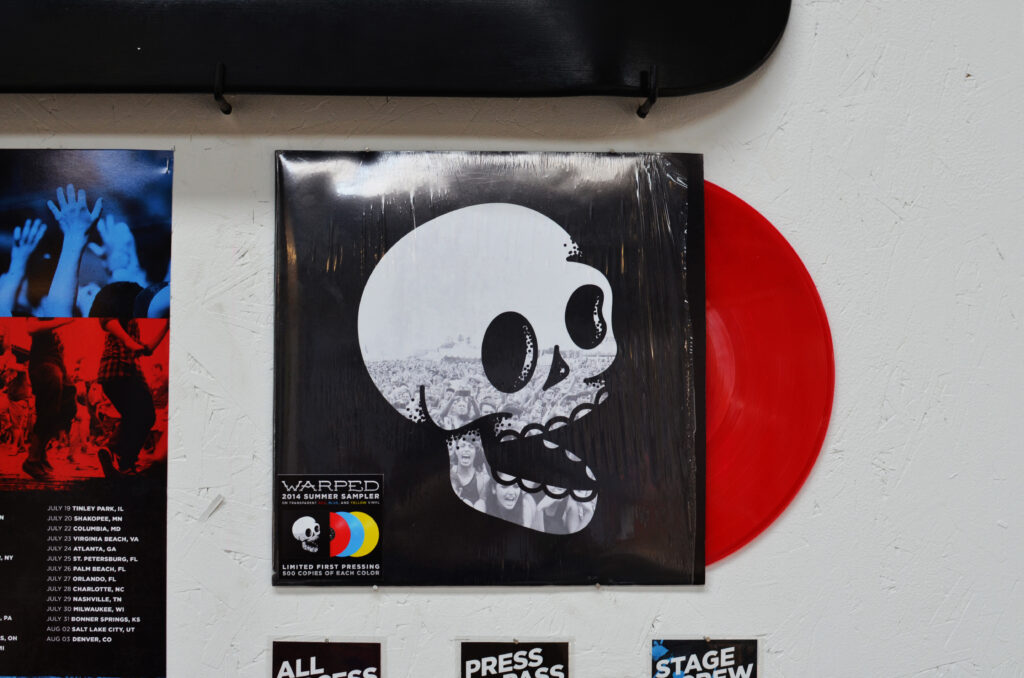
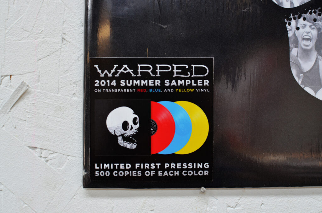
Leaving the logo mark black and white allows for easy application to other graphics, products, and treatments. In order to preserve the personality of the original brand, the three colors used have become accent colors to be used heavily in brand applications, such as print and web.
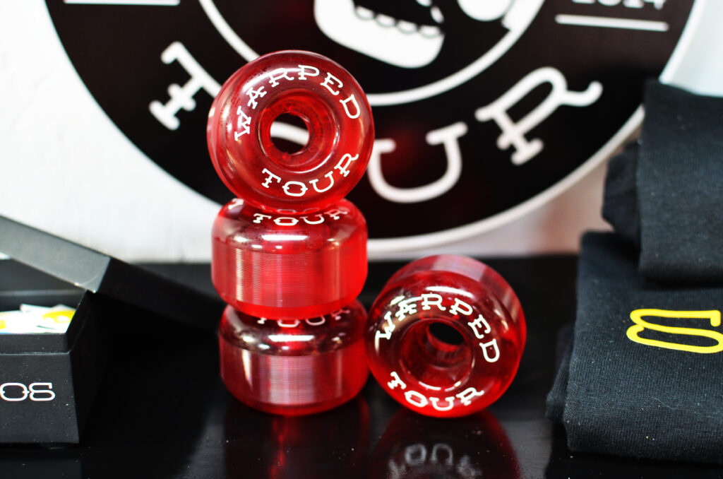
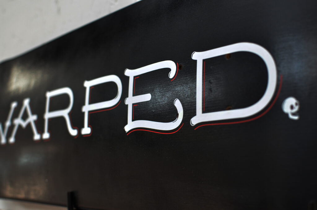
In order to support the new mark, a custom typeface was designed to be used sparingly. Mainly on large, minimal typographic applications such as t-shirts, skateboard decks, etc. For all other typography, a modern sans serif font was chosen in heavier weights to create a bold, dominant presence.
Secondary Elements
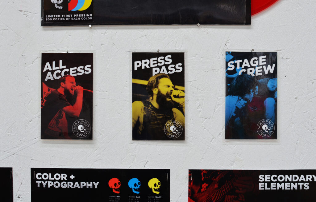
In addition to a bold, iconic color scheme and custom typography, the new identity uses three main secondary elements. First and foremost, live photography of the fans and bands from the most recent tour will be used. This allows the brand to capture the energy and excitement of the festival.
Second, texture and color overlays will be applied to the photography to keep them cohesive. Lastly, using the iconic checkerboard pattern made famous by Vans and the ska scene as inspiration, a large grid layout will be used in web, mobile and print applications.
