Nate from N.B.Oler, a specialist in engineering and fabrication services for high-quality stainless equipment in Bend, Oregon, came to me to enhancing their brand presence. The project started with refining their existing logo to better reflect the level of precision shown in their engineering, fabrication and custom manufacturing work.
A comprehensive brand identity expansion followed, encompassing typography, color palette, photo treatments, alternative logos, and team gear design to unify their visual identity. Marketing resources were developed to showcase their products’ superior craftsmanship and functionality, tailored to meet the specific needs of their diverse clientele. This streamlined approach aimed to elevate N.B.Oler’s professional image and market position.
Following the fearless leadership of Ngozi from Heat Free Hair, we embarked on a comprehensive project that included revitalizing their existing brand and launching a new product line. Initially, we were brought on board to focus on email marketing efforts that aligned with the brand’s mission of offering premium virgin hair extensions for natural textures.
Once we had earned the client’s trust that we understood her vision, the project then evolved into a full brand overhaul. Under the creative guidance of Carla Anderson, I redesigned the logo and landing pages to better reflect the brand’s updated identity and appeal. Following the brand refresh, I adapted the new branding into the email marketing strategy, ensuring a cohesive and updated look across all communications.
In the next phase of the project Carla and I collaboratively designed packaging for a new line of extension care kits, incorporating the revitalized brand elements to enhance customer experience and reinforce the brand’s premium quality.
Brand identity development of a new online outdoor training subscription for adventurous dogs and their humans. Project scope included fifteen monthly adventure badge sticker designs, and a self guided adventure journal.
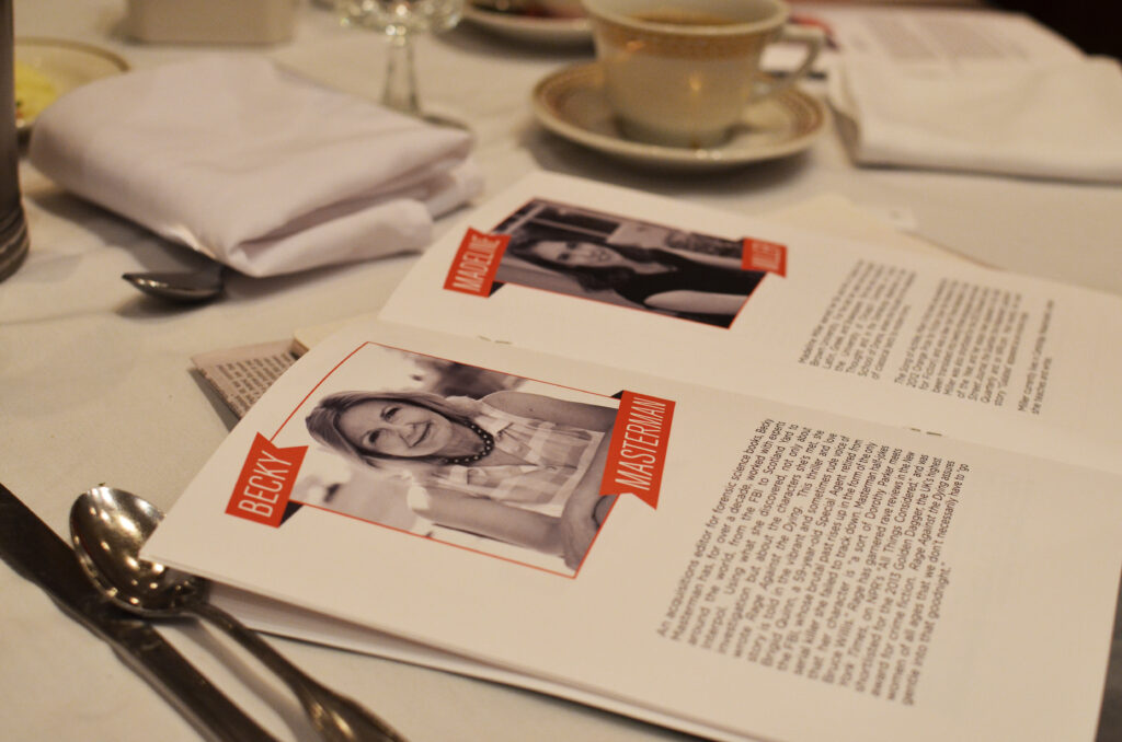
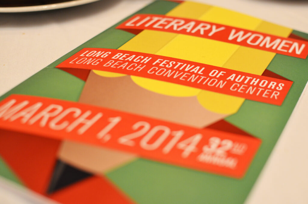
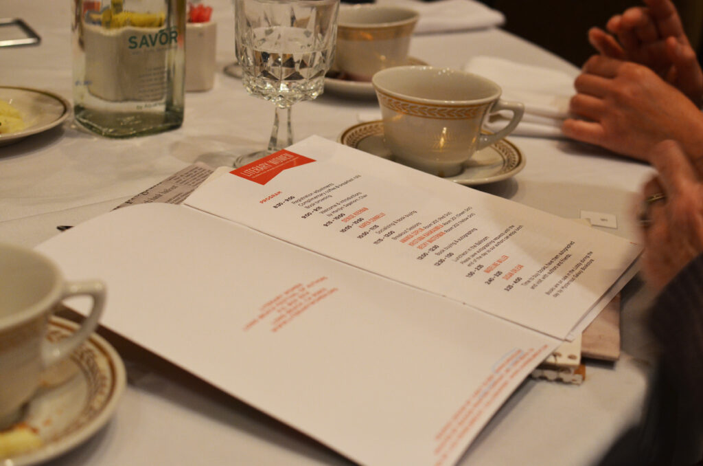
I was fortunate enough to be chosen as the program designer for the 2014 Literary Women: Long Beach Festival of Authors. It’s an annual festival that spotlights notable and upcoming female authors. The program committee I have had the pleasure of working with is a group of highly intelligent, poised, and educated women who I find absolutely inspiring. We worked together to design a program that showcased the event in a modern way that embodied the bold, energetic women who attend it.
This advertising campaign was designed for The Coffee Bean & Tea Leaf®’s line of single serve machines and capsules known as CBTL®. Created for our international markets, the goal was to build a holiday focused campaign that could endorse the products without being overtly promotional, and could continue to use the same tone of voice featured in previous advertisements. Imagery was custom built using coffee beans and capsule tops.
Bold. Vibrant. Refreshing. Mouth watering. Are we talking about Coffee Bean & Tea Leaf®’s sweet teas or this promotional poster campaign? I’ll let you decide.
For my final seasonal campaign with The Coffee Bean & Tea Leaf® we wanted to embrace the warm tones of fall, while enticing customers with playful flavor cues. Who doesn’t love to play with their food? Especially when its sweet sugary butterscotch and yummy pumpkin spices.
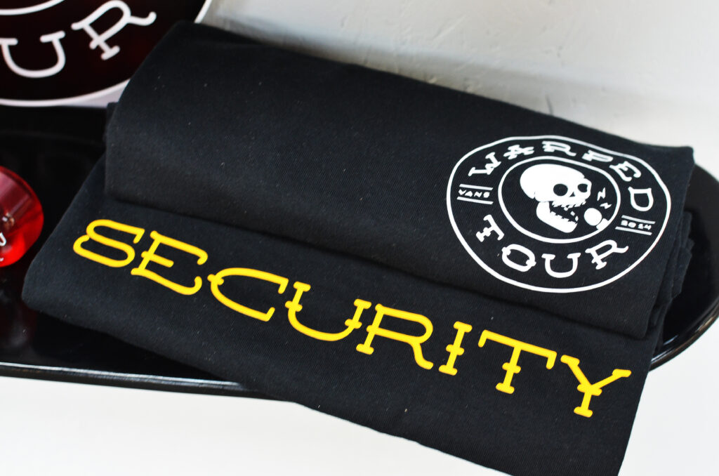
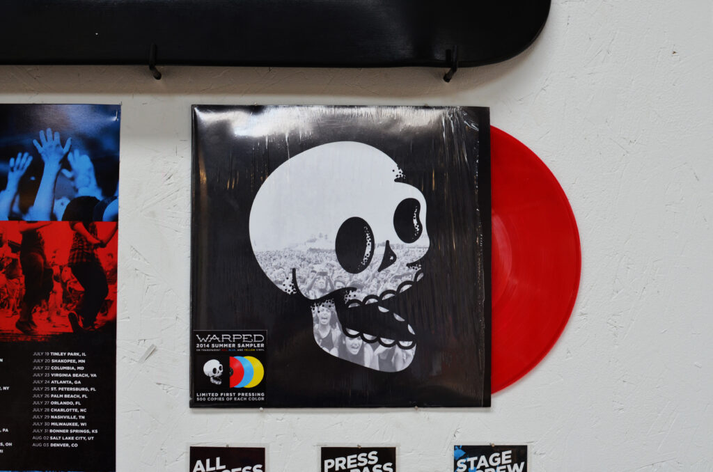
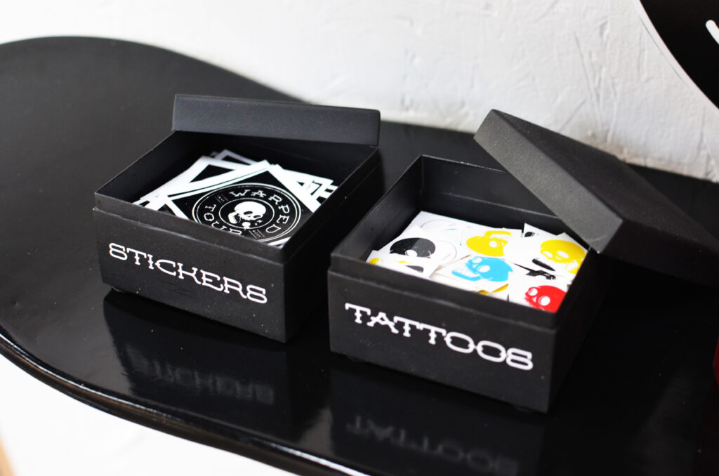
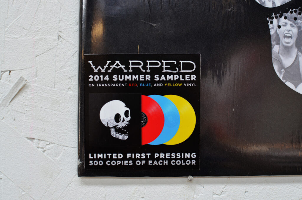
This project was done as a student project and has no connection with Warped Tour.
The current Warped Tour brand has remained practically the same for the last twenty years with slight variations from year to year. While the lineup has evolved beyond the strictly punk and ska bands featured during the nineties, the festival’s identity has not. In an effort to update, expand, and modernize the brand and all of it’s applications, a new identity system was created.
This new system is focused on the unique alternative culture and community that Warped Tour brings together every summer. In order to create a new look that wouldn’t alienate the dedicated bands and fans of the tour, many elements from the original branding were used as inspiration and reincorporated.
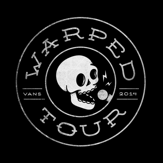
Logo
The new logo mark is embedded with several layers of symbolism. At the center of the mark, a singing skull was used to reference the heavy use of skulls and skeletons in the branding in previous years. Tattoo inspired typography represents the alternative nature of the festival, and the personal style of the artists and attendees who often have several tattoos of their own.
The overall shape of the mark has two meanings. First, it echoes the shape and coloring of a vinyl record, an item usually purchased by passionate music lovers who have an appreciation for tradition and quality. Second, it echoes the shape of a bus tire to reference one of the most unique aspects of Warped Tour – the fact that it is not a one day festival but a three month long traveling tour that stops at over fifty venues around the world.
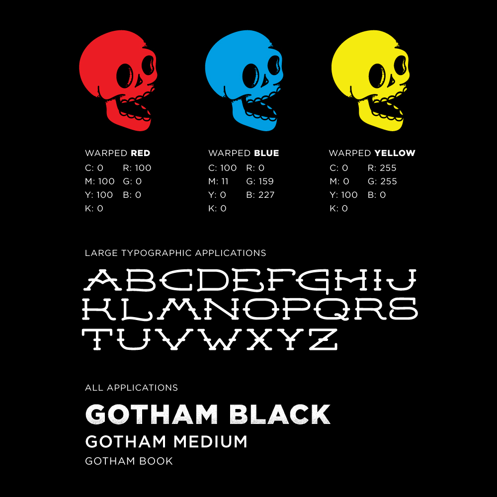
Color & Typography
Leaving the logo mark black and white allows for easy application to other graphics, products, and treatments. In order to preserve the personality of the original brand, the three colors used have become accent colors to be used heavily in brand applications, such as print and web.
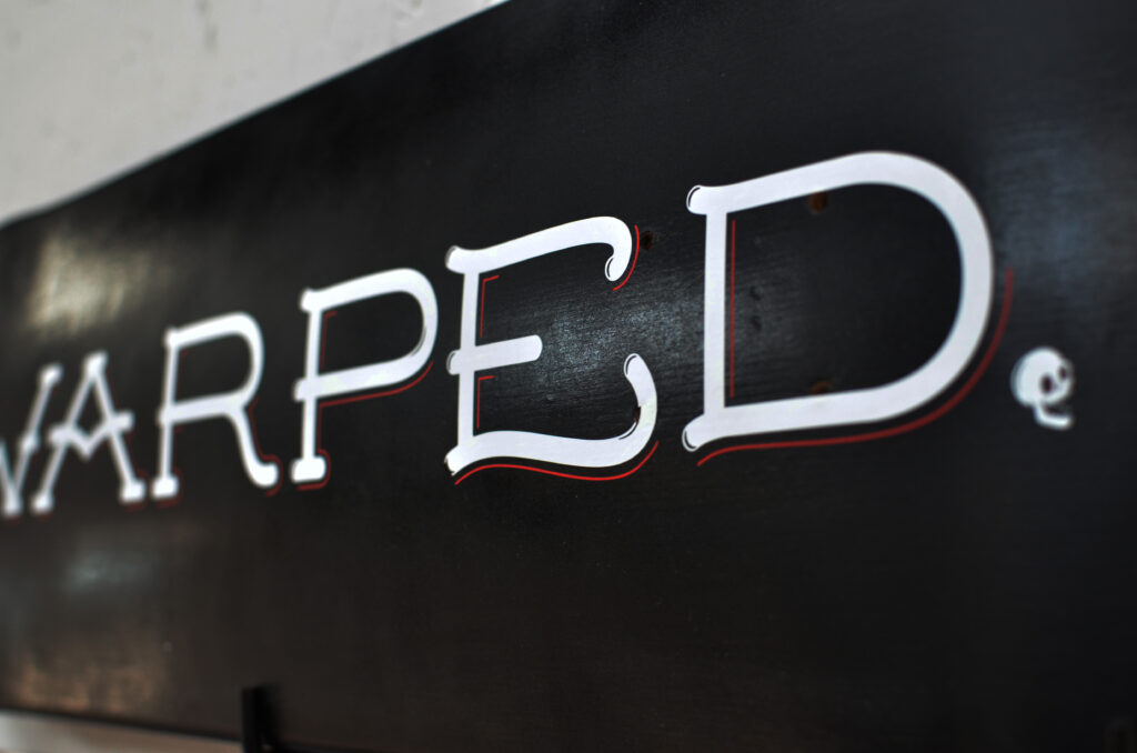
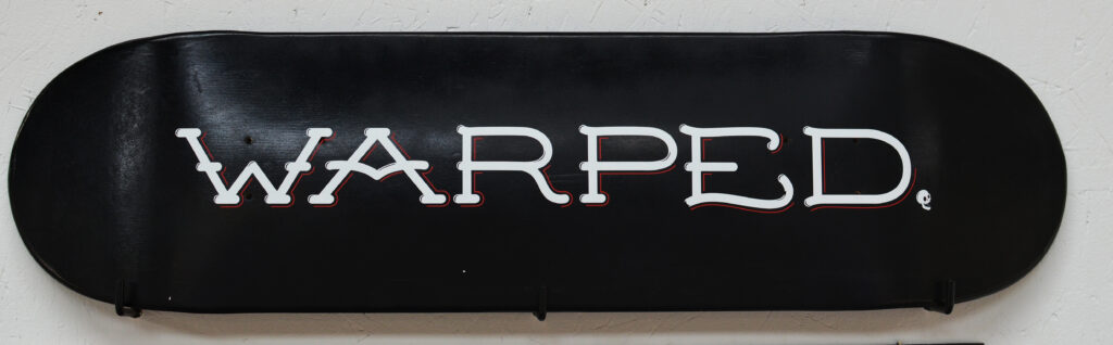
In order to support the new mark, a custom typeface was designed to be used sparingly. Mainly on large, minimal typographic applications such as t-shirts, skateboard decks, etc. For all other typography, a modern sans serif font was chosen in heavier weights to create a bold, dominant presence.
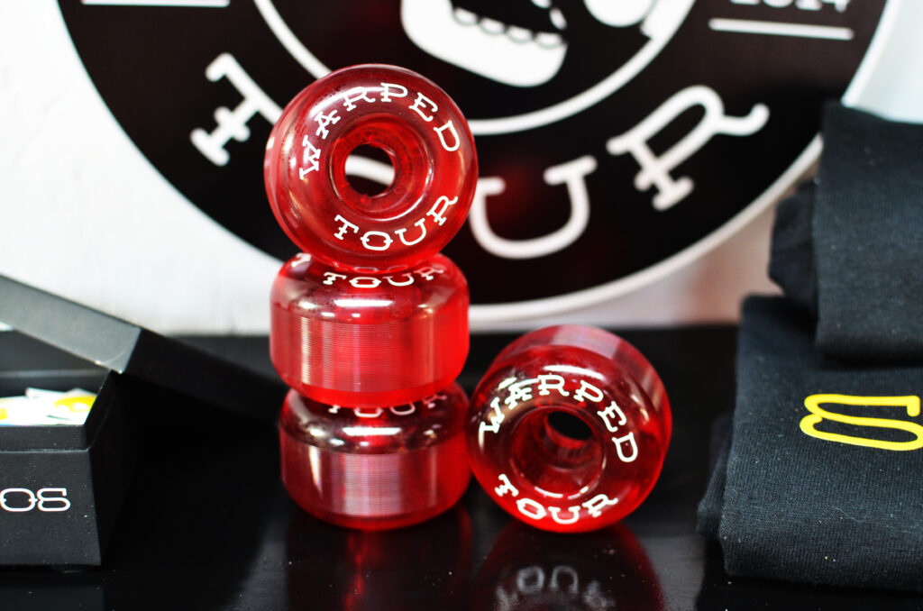
Secondary Elements
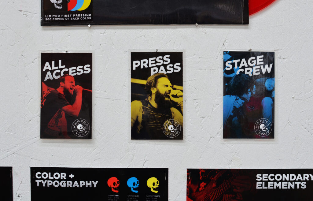
In addition to a bold, iconic color scheme and custom typography, the new identity uses three main secondary elements. First and foremost, live photography of the fans and bands from the most recent tour will be used. This allows the brand to capture the energy and excitement of the festival.
Second, texture and color overlays will be applied to the photography to keep them cohesive. Lastly, using the iconic checkerboard pattern made famous by Vans and the ska scene as inspiration, a large grid layout will be used in web, mobile and print applications.
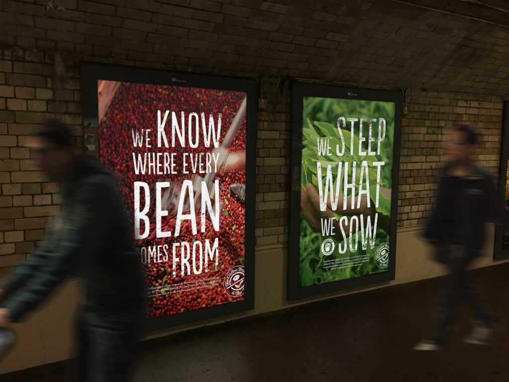
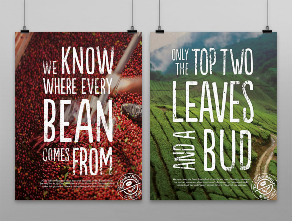
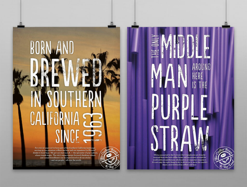
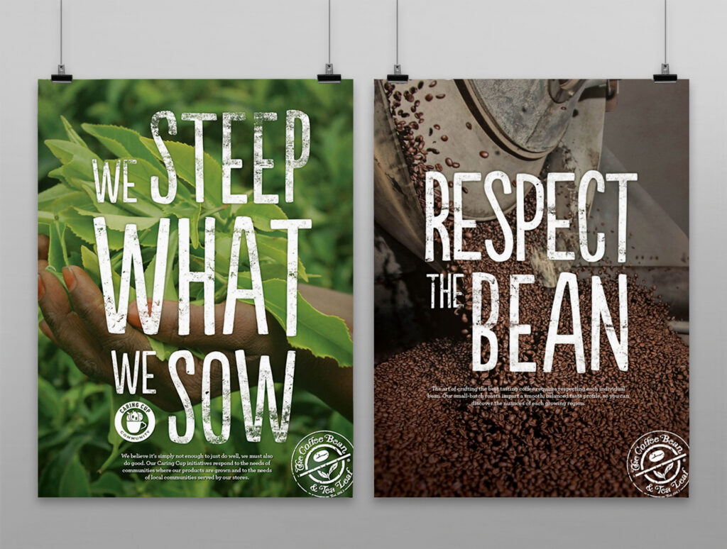
This poster series was designed for The Coffee Bean & Tea Leaf® to be used as promotional artwork as well as in store wall art. The goal was to highlight pre-existing “beanisms” or brand statements, in an engaging way that would encourage customers to read further and get to know the brand. These typographic lockups will ultimately be applied to java jackets, barista t-shirts, and various pieces of in-store collateral.
From concept to final collateral, the goal of this summertime campaign was to inspire customers to come in and “find your chill” by finding the Ice Blended® drink built just for you. Featuring a bold, graphic look with bright summer colors we wanted to refresh the look from our Spring POP so drastically that our customers just had to take notice. Using flavor cues as an active graphic element emphasized the playful side of The Coffee Bean® brand, while also symbolizing the nature of our signature Ice Blended® drinks. From in store POP to barista gear and social media content, this campaign kicked off summer with a vibrant splash.