This advertising campaign was designed for The Coffee Bean & Tea Leaf®’s line of single serve machines and capsules known as CBTL®. Created for our international markets, the goal was to build a holiday focused campaign that could endorse the products without being overtly promotional, and could continue to use the same tone of voice featured in previous advertisements. Imagery was custom built using coffee beans and capsule tops.
Bold. Vibrant. Refreshing. Mouth watering. Are we talking about Coffee Bean & Tea Leaf®’s sweet teas or this promotional poster campaign? I’ll let you decide.
For my final seasonal campaign with The Coffee Bean & Tea Leaf® we wanted to embrace the warm tones of fall, while enticing customers with playful flavor cues. Who doesn’t love to play with their food? Especially when its sweet sugary butterscotch and yummy pumpkin spices.
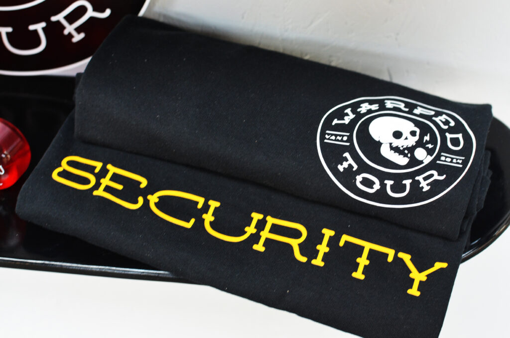
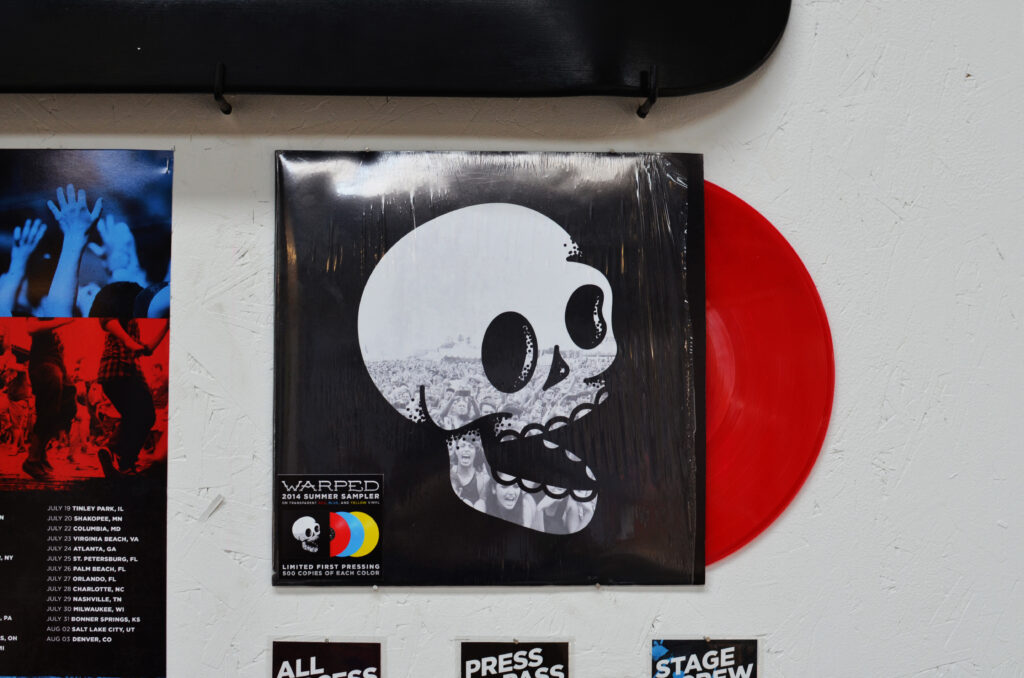
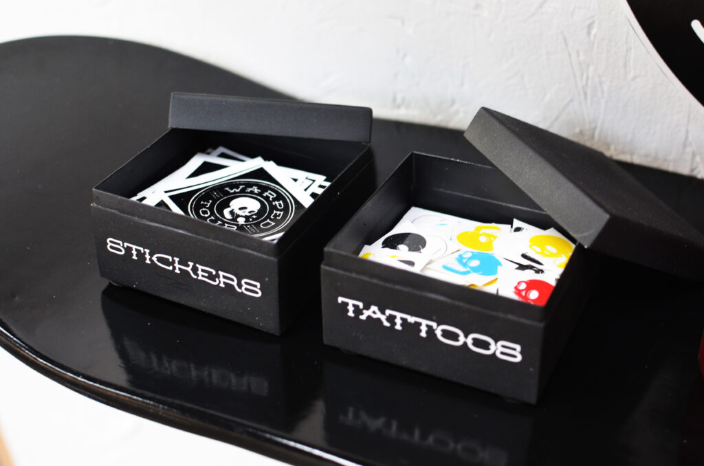
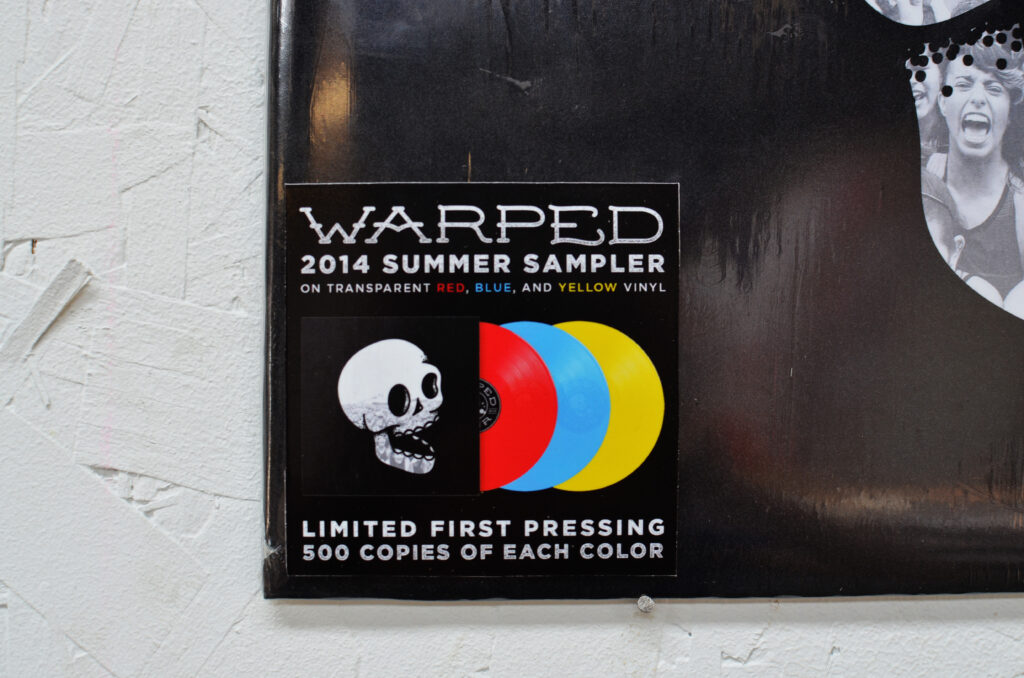
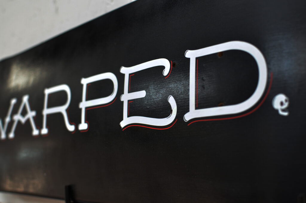
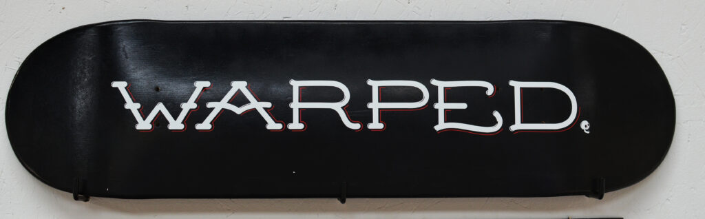
This project was done as a student project and has no connection with Warped Tour.
The current Warped Tour brand has remained practically the same for the last twenty years with slight variations from year to year. While the lineup has evolved beyond the strictly punk and ska bands featured during the nineties, the festival’s identity has not. In an effort to update, expand, and modernize the brand and all of it’s applications, a new identity system was created.
This new system is focused on the unique alternative culture and community that Warped Tour brings together every summer. In order to create a new look that wouldn’t alienate the dedicated bands and fans of the tour, many elements from the original branding were used as inspiration and reincorporated.
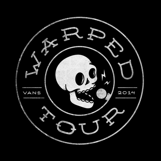
Logo
The new logo mark is embedded with several layers of symbolism. At the center of the mark, a singing skull was used to reference the heavy use of skulls and skeletons in the branding in previous years. Tattoo inspired typography represents the alternative nature of the festival, and the personal style of the artists and attendees who often have several tattoos of their own.
The overall shape of the mark has two meanings. First, it echoes the shape and coloring of a vinyl record, an item usually purchased by passionate music lovers who have an appreciation for tradition and quality. Second, it echoes the shape of a bus tire to reference one of the most unique aspects of Warped Tour – the fact that it is not a one day festival but a three month long traveling tour that stops at over fifty venues around the world.
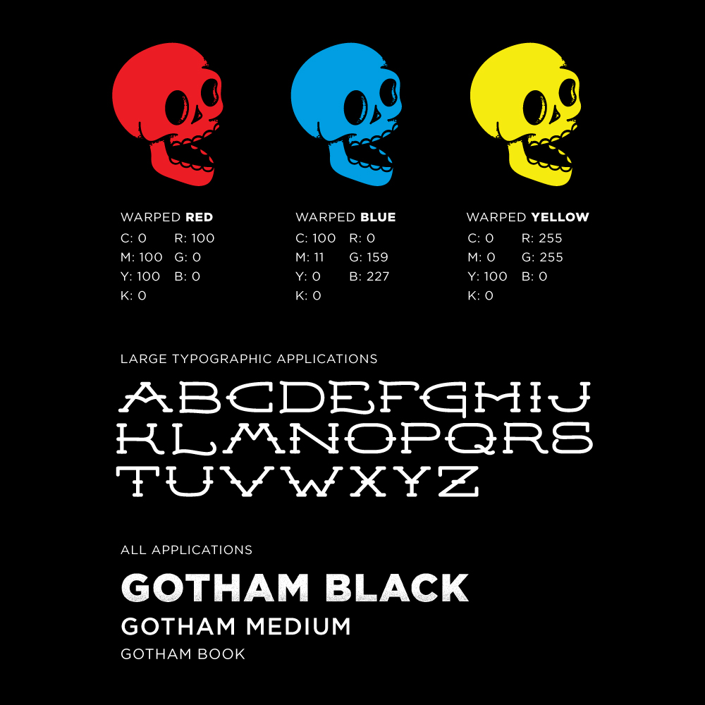
Color & Typography
Leaving the logo mark black and white allows for easy application to other graphics, products, and treatments. In order to preserve the personality of the original brand, the three colors used have become accent colors to be used heavily in brand applications, such as print and web.
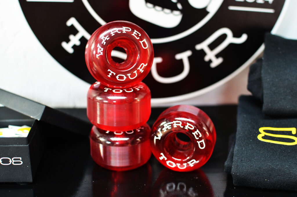
In order to support the new mark, a custom typeface was designed to be used sparingly. Mainly on large, minimal typographic applications such as t-shirts, skateboard decks, etc. For all other typography, a modern sans serif font was chosen in heavier weights to create a bold, dominant presence.
Secondary Elements
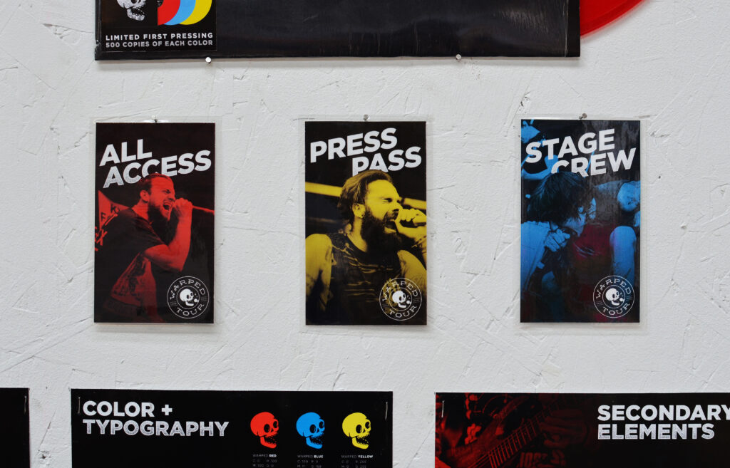
In addition to a bold, iconic color scheme and custom typography, the new identity uses three main secondary elements. First and foremost, live photography of the fans and bands from the most recent tour will be used. This allows the brand to capture the energy and excitement of the festival.
Second, texture and color overlays will be applied to the photography to keep them cohesive. Lastly, using the iconic checkerboard pattern made famous by Vans and the ska scene as inspiration, a large grid layout will be used in web, mobile and print applications.
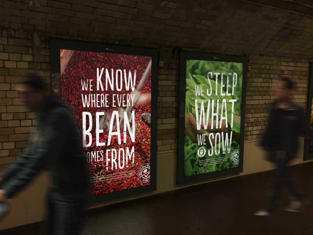
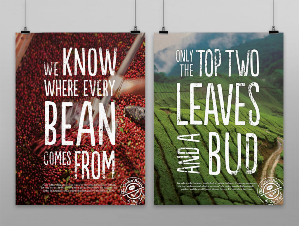
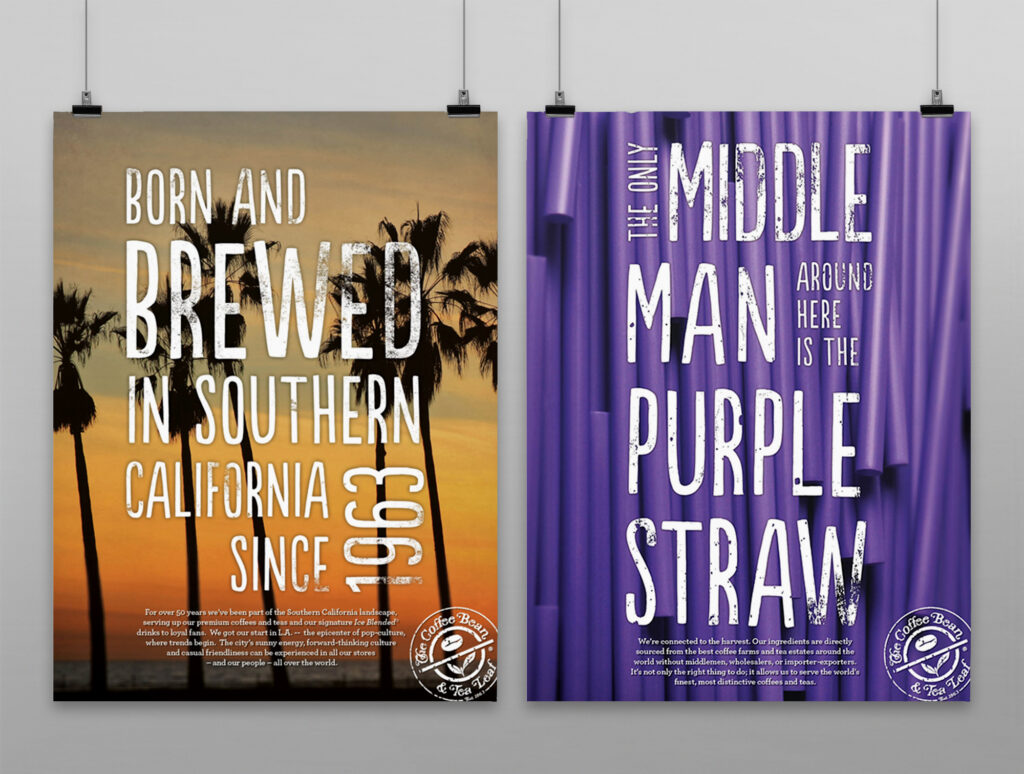
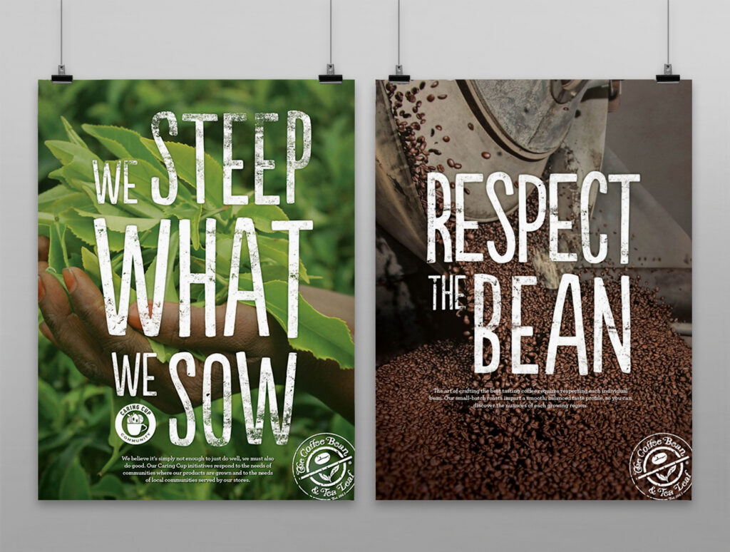
This poster series was designed for The Coffee Bean & Tea Leaf® to be used as promotional artwork as well as in store wall art. The goal was to highlight pre-existing “beanisms” or brand statements, in an engaging way that would encourage customers to read further and get to know the brand. These typographic lockups will ultimately be applied to java jackets, barista t-shirts, and various pieces of in-store collateral.
From concept to final collateral, the goal of this summertime campaign was to inspire customers to come in and “find your chill” by finding the Ice Blended® drink built just for you. Featuring a bold, graphic look with bright summer colors we wanted to refresh the look from our Spring POP so drastically that our customers just had to take notice. Using flavor cues as an active graphic element emphasized the playful side of The Coffee Bean® brand, while also symbolizing the nature of our signature Ice Blended® drinks. From in store POP to barista gear and social media content, this campaign kicked off summer with a vibrant splash.
For our international markets we featured a twist on a classic by promoting a line of Mocha Coconut beverages. The concept behind the campaign was to focus on the simplistic beauty of the coconut itself, and the beautiful tropical environments they grow in. Contrasting bright whites and dark, rich browns created a freshness inspired by the flavor. Using palm leaves and pops of bold, vibrant green, we brought an island flair to these premium hand crafted drinks.
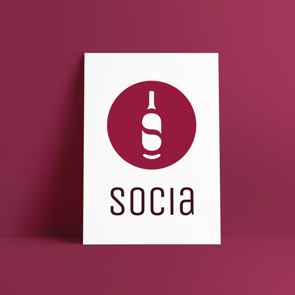
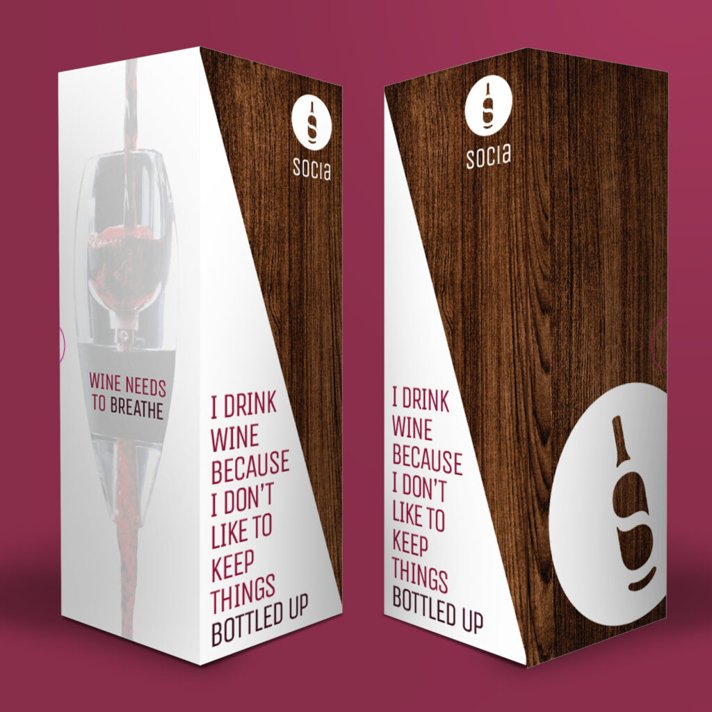
Josh came to me with a plan. He wanted to brand a line of wine-related products in a new, modern way that embraced his favorite thing about wine – the social aspect. Together we created the look for Socia. Combining the timeless silhouette of a wine bottle with two modern talk bubbles, we created a negative space monogram to pair with a modern sans-serif logotype. This new brand aims to bring people together for a cathartic experience of sharing, laughing and sipping wine together.
Over the last decade ABEO has expanded from one sub brand “system” to seven. With each new sub brand came new packaging, a new logo, and new collateral. When I came on board in 2015, our main focus was to revise the ABEO brand into one unified, cohesive look and feel that was recognizable across all sub brands. One key component of this redesign was the footwear packaging itself, which is not only seen by customers, but used by our in store fit experts as a sales tool as well. With a new color coding system in place, we created a line of packaging that represented ABEO as the modern, innovative brand that it has become.
After two great years designing the program for the annual Literary Women Festival I was asked to join them again for the 2016 event. This festival highlights notable and upcoming inspiring female authors and it attended by over 800 women annually. For a change of pace we decided to fully embrace the feminine with a soft color palette and bold floral patterns.