Email marketing campaigns from 2019 to 2020.
Agency: Tinuiti


Email marketing campaigns and social media concepts from 2018 to 2020.
Agency: Tinuiti
Team: Angela Bartlett, Keri Brooks


Logo Design

Website Design
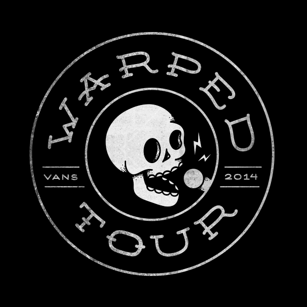
This project was done as a student project and has no connection with Warped Tour.
The current Warped Tour brand has remained practically the same for the last twenty years with slight variations from year to year. While the lineup has evolved beyond the strictly punk and ska bands featured during the nineties, the festival’s identity has not. In an effort to update, expand, and modernize the brand and all of it’s applications, a new identity system was created.
This new system is focused on the unique alternative culture and community that Warped Tour brings together every summer. In order to create a new look that wouldn’t alienate the dedicated bands and fans of the tour, many elements from the original branding were used as inspiration and reincorporated.
Logo
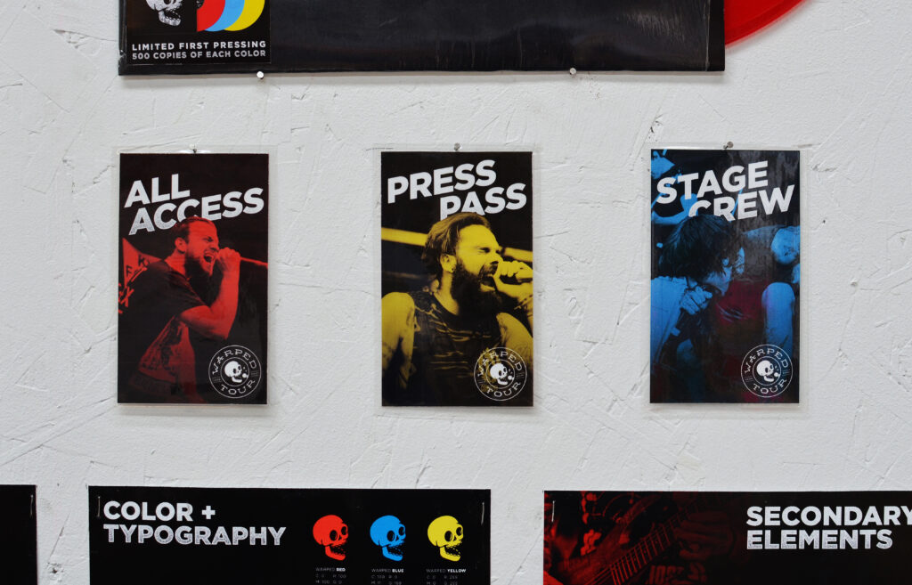
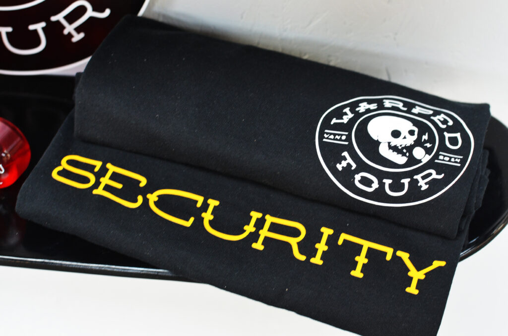
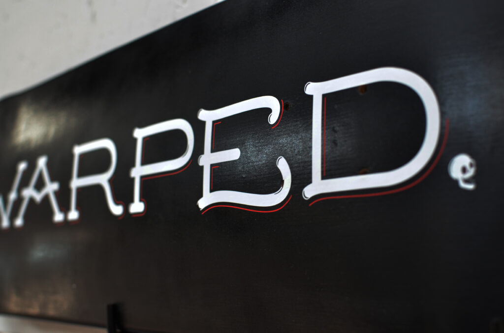
The new logo mark is embedded with several layers of symbolism. At the center of the mark, a singing skull was used to reference the heavy use of skulls and skeletons in the branding in previous years. Tattoo inspired typography represents the alternative nature of the festival, and the personal style of the artists and attendees who often have several tattoos of their own.
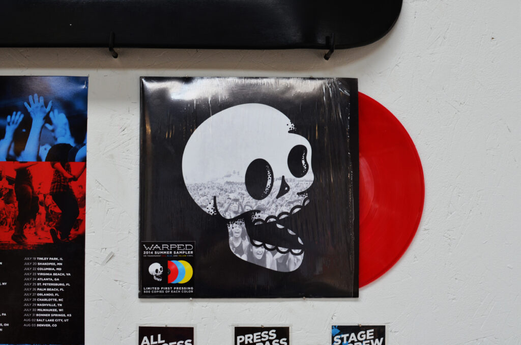
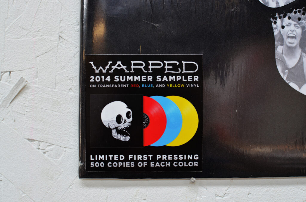
The overall shape of the mark has two meanings. First, it echoes the shape and coloring of a vinyl record, an item usually purchased by passionate music lovers who have an appreciation for tradition and quality. Second, it echoes the shape of a bus tire to reference one of the most unique aspects of Warped Tour – the fact that it is not a one day festival but a three month long traveling tour that stops at over fifty venues around the world.
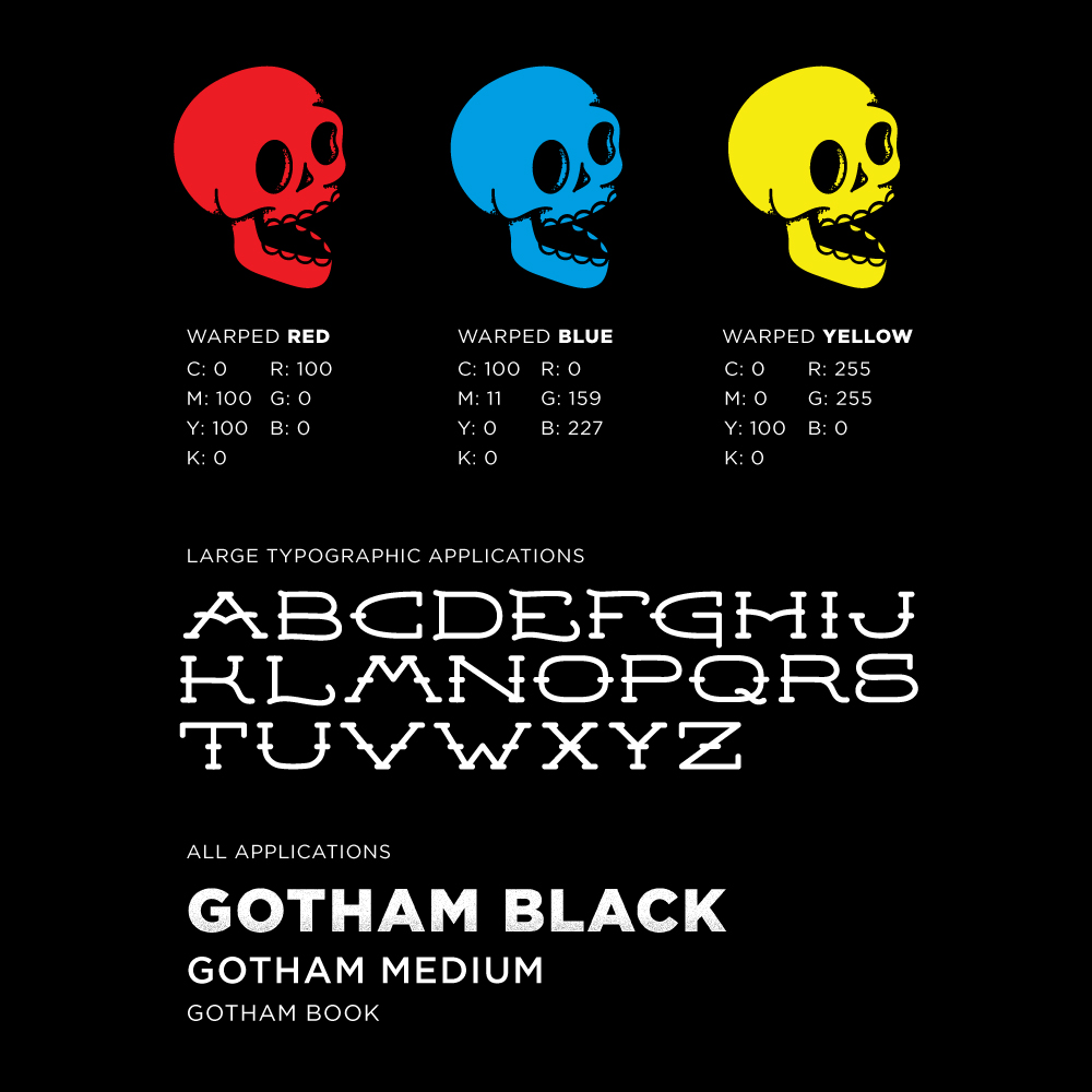
Color & Typography
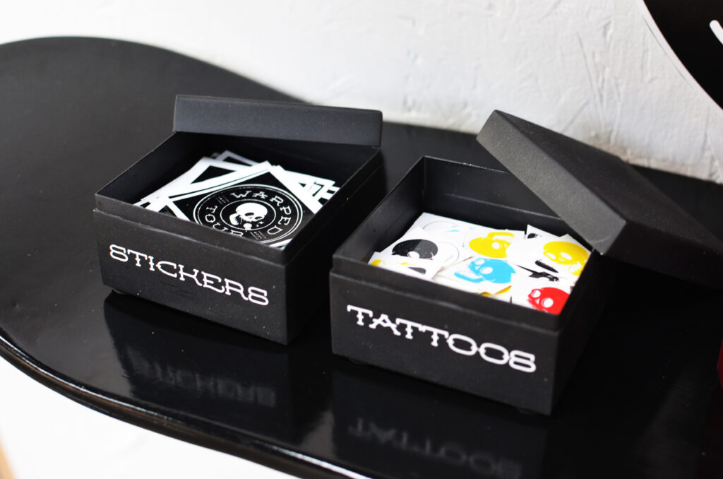
Leaving the logo mark black and white allows for easy application to other graphics, products, and treatments. In order to preserve the personality of the original brand, the three colors used have become accent colors to be used heavily in brand applications, such as print and web.
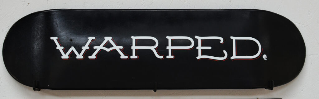
In order to support the new mark, a custom typeface was designed to be used sparingly. Mainly on large, minimal typographic applications such as t-shirts, skateboard decks, etc. For all other typography, a modern sans serif font was chosen in heavier weights to create a bold, dominant presence.
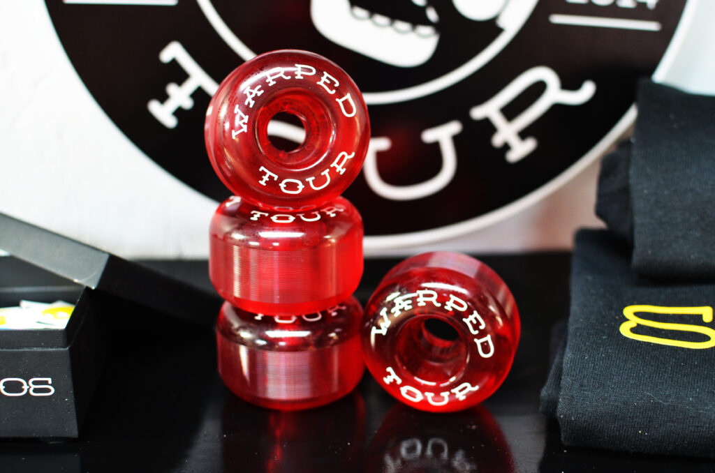
Secondary Elements
In addition to a bold, iconic color scheme and custom typography, the new identity uses three main secondary elements. First and foremost, live photography of the fans and bands from the most recent tour will be used. This allows the brand to capture the energy and excitement of the festival.
Second, texture and color overlays will be applied to the photography to keep them cohesive. Lastly, using the iconic checkerboard pattern made famous by Vans and the ska scene as inspiration, a large grid layout will be used in web, mobile and print applications.


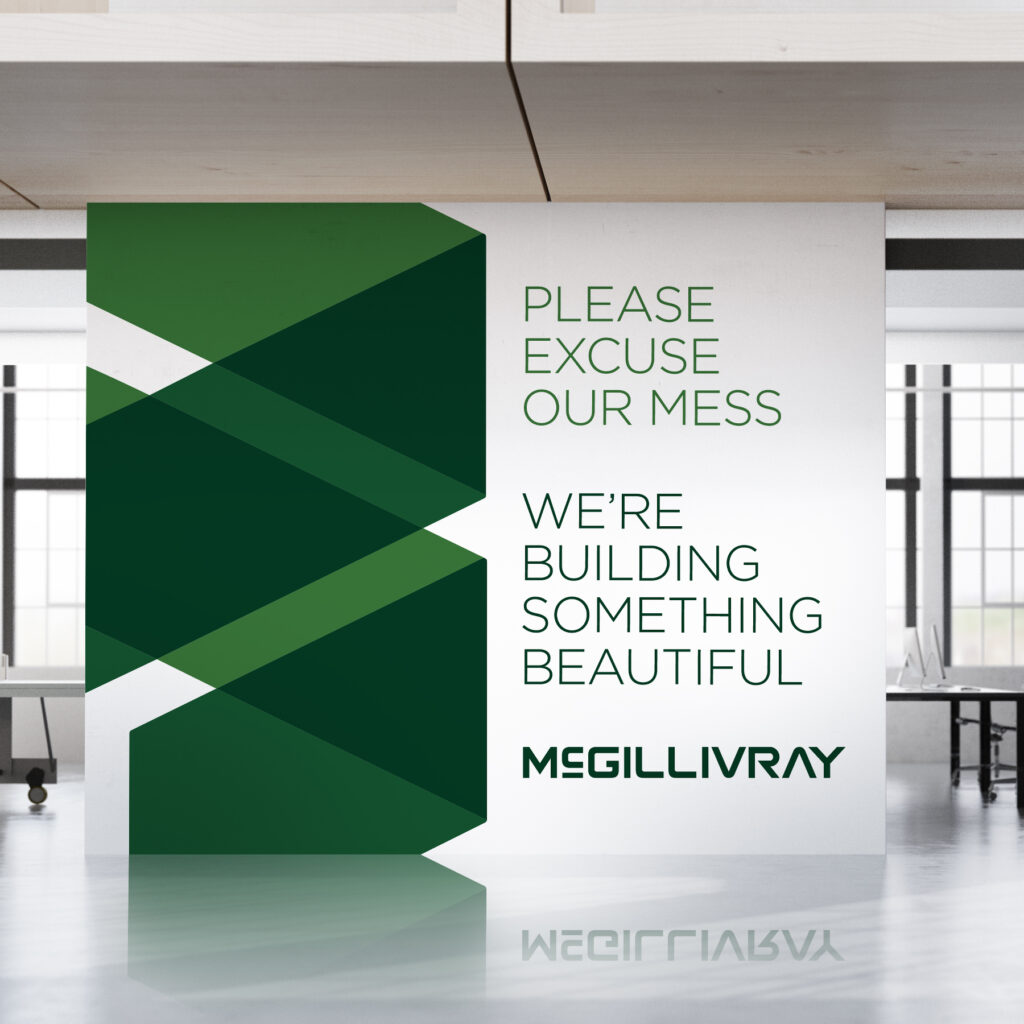
General contractors tend to brand their company by using their own last name, merging their own identity with that of their business. With this in mind, I worked with Steve McGillivray to create a brand that he felt proud to put his name on. After a prior attempt at rebranding left the McGillivray brand looking generic and indistinguishable from other contractors in town, Steve was hesitant to try again so soon. But we made a plan to go back to what he loved most about his brand from the beginning.
We kept his last name in its entirety and stylized it in a way that felt solid and substantial, but also modern. We chose to return to the all green natural color palette and expanded it to include darker shades for better contrast and visibility. The logo mark itself was designed to represent building blocks actively being stacked on top of one another, as if you’re watching the logo being built. This “corner stone” being formed by simple geometric shapes communicates a strong, well-built foundation which is the key to any successful construction project.
Eventually Steve returned to develop a refreshed website that aligned with their new brand identity.
Brand Identity


Website Design


Logo and business card design for Folsom Street Chains, a local artist made line of recycled leather and chains for you and your plants inspired by Folsom Street in San Francisco, California.
Visit the Folsom Street Etsy shop here.


In this day and age brands and their designers have to be versatile. As our customers move away from printed catalogs and marketing materials, we’ve expanded our reach to social platforms like Facebook, Instagram and Pinterest. But you can’t just post lifestyles any more. You have to post creative, original content that tells the story of your brand with little to no explanation. Included in this refreshing of ABEO’s social media strategy and content are various themed series of images meant to highlight the advanced biomechanics technology infused in every style we produce without overloading followers with heavy technical information.
Creative Direction: Ryan Powell
Shoe Photography: Jim Haschmann


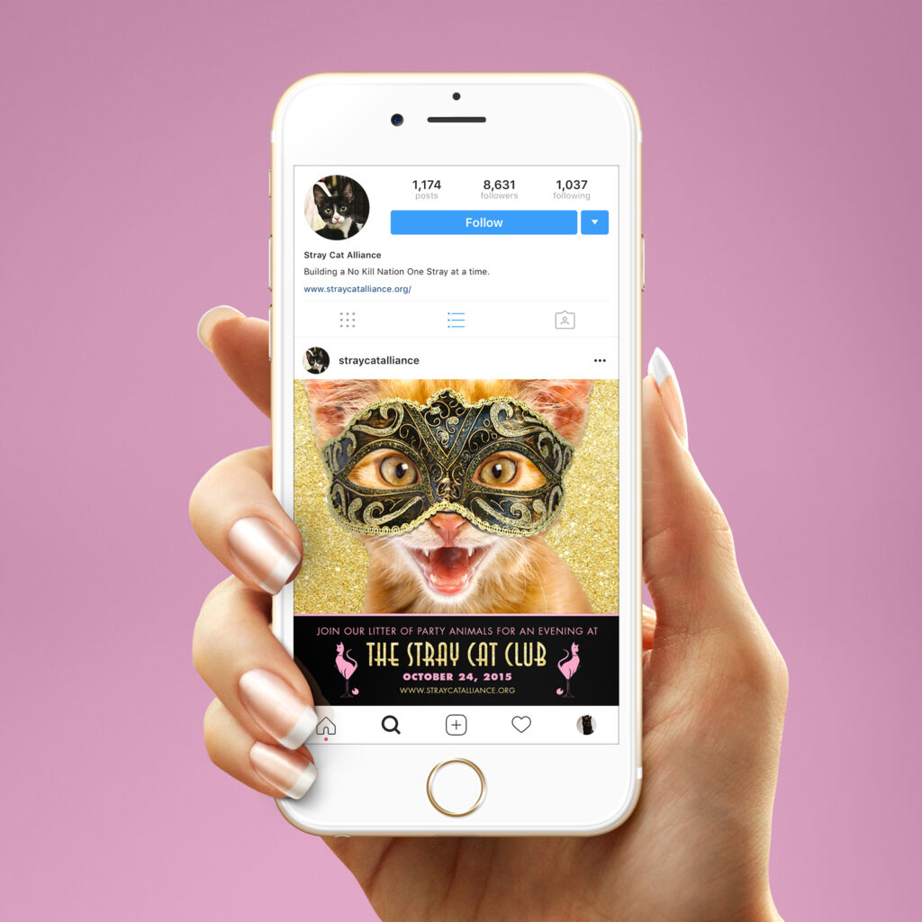
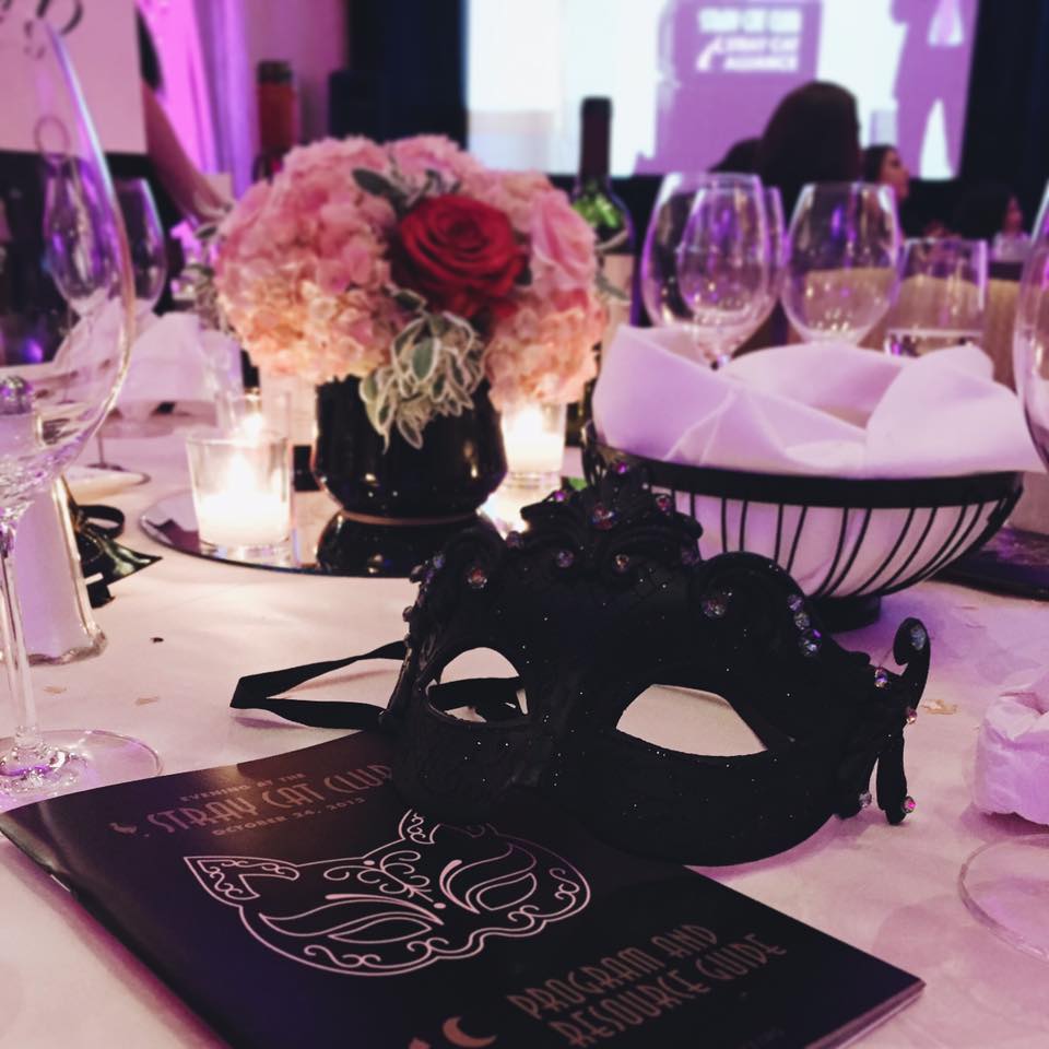
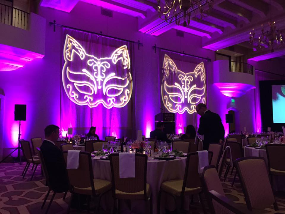
Cat ladies may be crazy, but they’re also crazy passionate.
In my work with the Stray Cat Alliance rescue I’ve learned that there is nothing these women cannot accomplish when they set their minds to it. Together we created a beautiful look and feel for their annual Stray Cat Club gala event that captured the high class atmosphere while still embracing the fun, informal energy of the event.
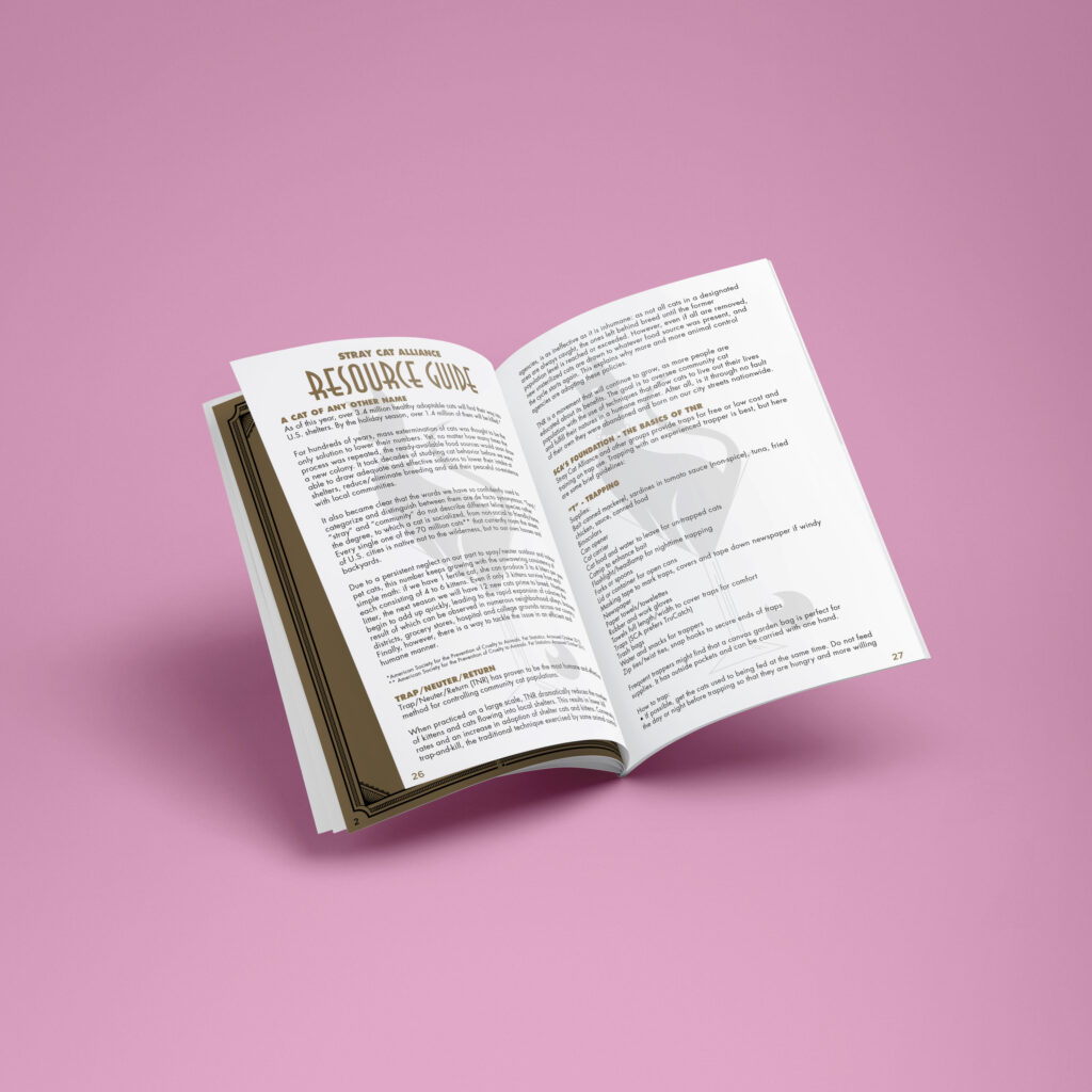
Included in this project was the design of the signature feline masquerade mask that became a new logo for the event. We also put together a program that doubles as a resource guide for attendees to take with them afterwards with tips, tricks and tons of helpful information to improve TNR practices, encourage animal fostering, promote forever adoptions, and inspire a new group of animal welfare advocates.
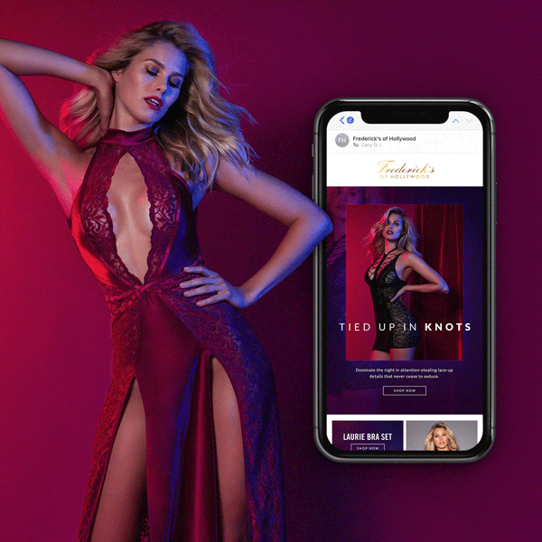
Since 1947 the Frederick’s of Hollywood brand has established itself as one of the most iconic names in lingerie. After redirecting their retail experience to a purely digital space in 2016, they maintained the infamous name while continuing to evolve the visual brand identity on a seasonal basis. The challenge then became standing out in an oversaturated digital market – the inbox. With the help of the stellar client team, we were able to take the brand in a fresh creative direction every season.
Agency: Tinuiti
Team: Mandi Moshay, Alison Clifford, Cindy Goodman, Sheridan Torgerson, Katie Serniak, Kristin McCarty, Megan Lucht-Falcon, Lindsey Newman-Segura


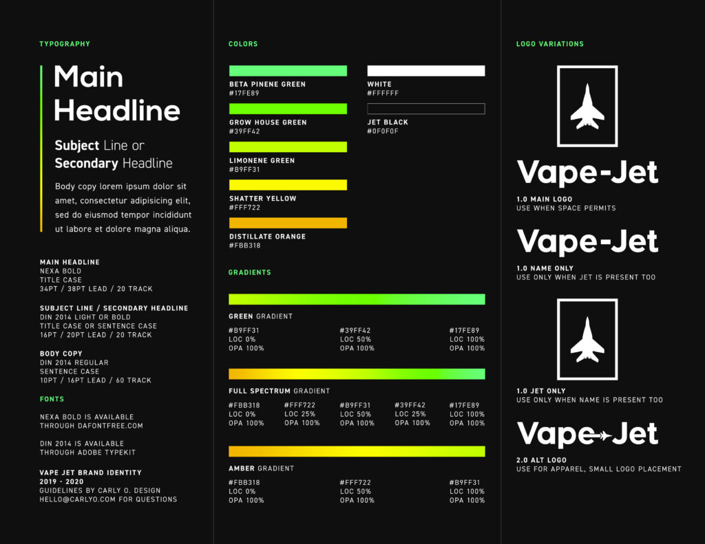
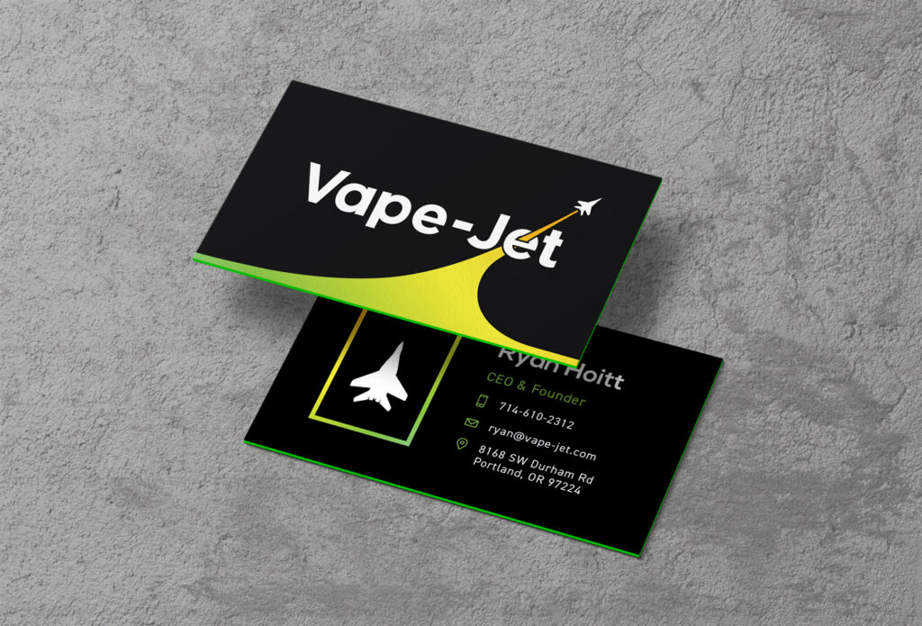
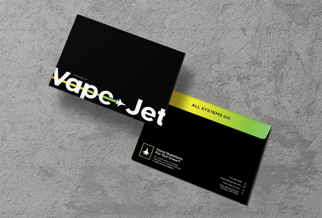
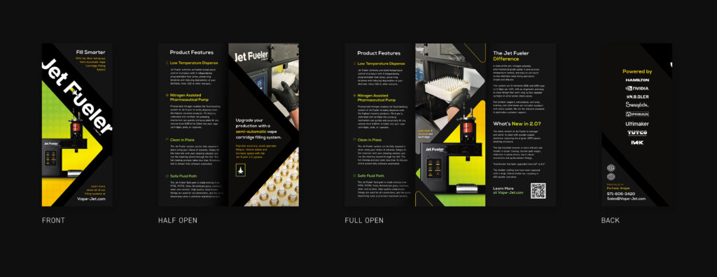
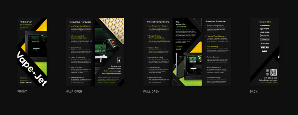
Exploring the intersection between automation technology and the cannabis industry, this B2B brand is a fusion of the bold, sleek style of cutting edge tech companies with the vibrant energetic personality of modern cannabis enthusiasts.
As Creative Director I’ve been involved with Vape-Jet’s marketing efforts from the early start up phases. I’ve worked with the team to develop their brand identity, designed and built various iterations of the website, shot product photography and video content, created promotional printed materials, brand swag, product packaging, social media and email marketing assets.
Additionally, I worked with partner brands in the industry to establish and expand the Vape-Jet Partner Program. In recent years I have collaborated with human copywriters and implemented AI copywriting tools to produce blog posts on the Vape-Jet Crew Blog.
Visit Vape-Jet.com to see more.
Logo Design
Brand Guidelines
Stationery, Printed Sales & Marketing Materials

Product Photography


Social Media Photography, Graphics, Copywriting, Calendar Management


Website Design


Filming, Video Editing and Animation
Event Planning, Coordinating and Coverage