From concept to final collateral, the goal of this summertime campaign was to inspire customers to come in and “find your chill” by finding the Ice Blended® drink built just for you. Featuring a bold, graphic look with bright summer colors we wanted to refresh the look from our Spring POP so drastically that our customers just had to take notice. Using flavor cues as an active graphic element emphasized the playful side of The Coffee Bean® brand, while also symbolizing the nature of our signature Ice Blended® drinks. From in store POP to barista gear and social media content, this campaign kicked off summer with a vibrant splash.
Month: April 2021
For our international markets we featured a twist on a classic by promoting a line of Mocha Coconut beverages. The concept behind the campaign was to focus on the simplistic beauty of the coconut itself, and the beautiful tropical environments they grow in. Contrasting bright whites and dark, rich browns created a freshness inspired by the flavor. Using palm leaves and pops of bold, vibrant green, we brought an island flair to these premium hand crafted drinks.
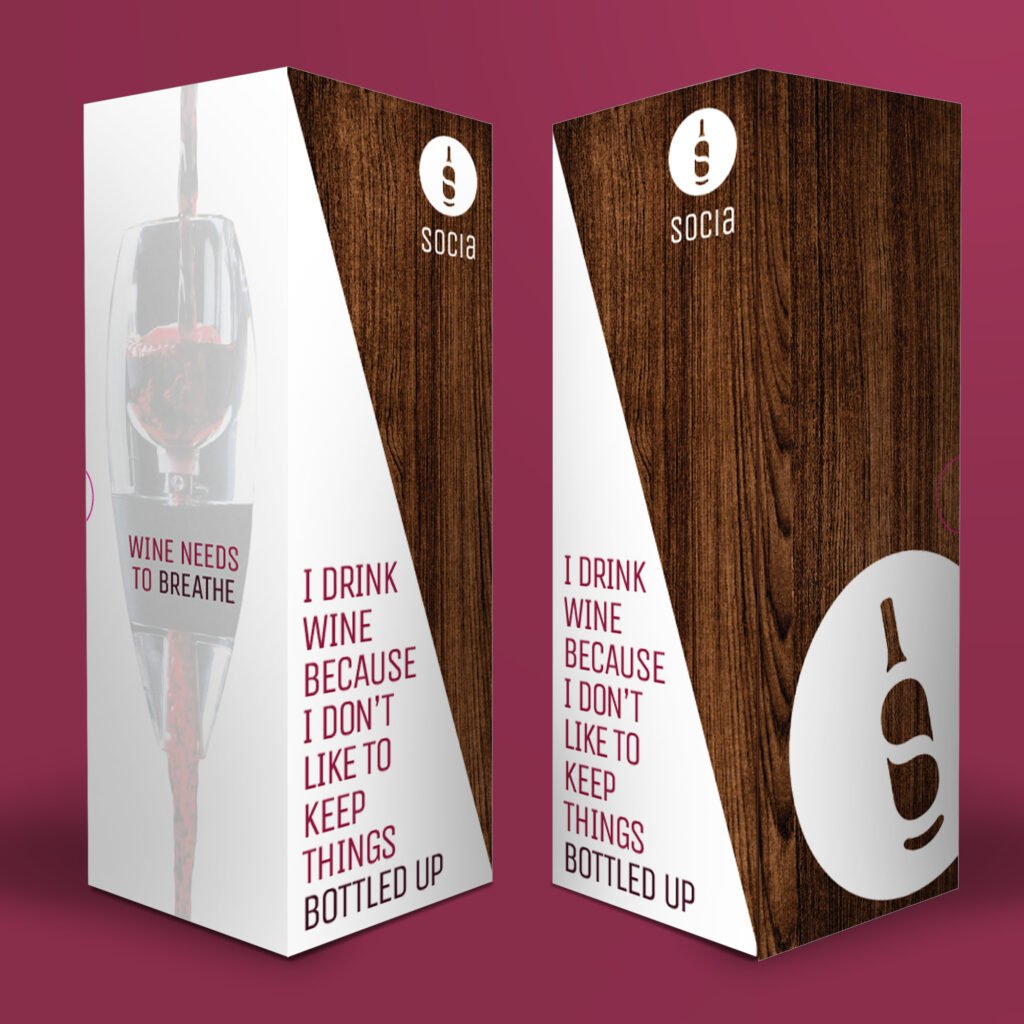
Josh came to me with a plan. He wanted to brand a line of wine-related products in a new, modern way that embraced his favorite thing about wine – the social aspect. Together we created the look for Socia. Combining the timeless silhouette of a wine bottle with two modern talk bubbles, we created a negative space monogram to pair with a modern sans-serif logotype. This new brand aims to bring people together for a cathartic experience of sharing, laughing and sipping wine together.
ABEO Footwear Retail
Over the last decade ABEO has expanded from one sub brand “system” to seven. With each new sub brand came new packaging, a new logo, and new collateral. When I came on board in 2015, our main focus was to revise the ABEO brand into one unified, cohesive look and feel that was recognizable across all sub brands. One key component of this redesign was the footwear packaging itself, which is not only seen by customers, but used by our in store fit experts as a sales tool as well. With a new color coding system in place, we created a line of packaging that represented ABEO as the modern, innovative brand that it has become.
Creative Direction: Ryan Powell
Literary Women 2016
After two great years designing the program for the annual Literary Women Festival I was asked to join them again for the 2016 event. This festival highlights notable and upcoming inspiring female authors and it attended by over 800 women annually. For a change of pace we decided to fully embrace the feminine with a soft color palette and bold floral patterns.
Across the Formidable Sea
Across the Formidable Sea by Claire Laminen
Claire came to me looking for the perfect cover design for her first self-published novel. After discussing the story, we chose a design that reflected the journey the main character Laura makes by boat from her home in America to the other side of the Atlantic. The fog rolling in and obscuring the horizon reflects on Laura’s own unknown exploration to a new place, a new life and a new version of herself.
ABEO Footwear South Coast Plaza
With a completed brand refresh and updated packaging, ABEO® was ready to reintroduce itself to customers in brand new retail locations in Virginia, Hawaii, and a shop-in-shop at The Walking Company® South Coast Plaza. Our main objective was to use the new identity system to inform customers about the brand as whole as well as each individual sub brand.
Creative Direction: Ryan Powell
Store Design: Joe Aulenta
Visual Merchandising: Wendy Kegley, Kimberly Gamboa and Gilliane Sydiongco
Rio Lindo Elementary
In 2016 the staff at Rio Lino Elementary School approached me about redesigning their logo. The previous one had lasted them years, but was hand drawn by one of the student’s parents and was in need of an upgrade. Together we worked on a series of bright, bold logo designs that captured the passion and ambition that the teachers and staff encourage in their students. We kept it colorful and cartoon inspired to invoke the same sense of play and wonder that all K-5 students should have when it comes to learning.
The Walking Company Fall 2016
Seasonal catalogs have become a key part of The Walking Company’s retail business. With a variety of brands and a wide range of products all vying for attention, the catalog had become a bit difficult to navigate. In Fall of 2016 we decided to update the look and feel by adding a consistent structure and hierarchy. Using tone on tone color palettes, a strong grid, and a minimalist color block aesthetic we were able to organize the layout of each spread as well as shift the focus to the full color product photography and features and benefits information.
Creative Direction: Ryan Powell
FootSmart Spring 2017
When The Walking Company® acquired FootSmart® they reduced their catalog publications from twelve a year to one per season. Taking on a whole new brand meant learning a new type of consumer. One who was a bit older, possibly retired, and looking for shopping experience that required minimal online browsing. We decided to approach them with a refreshed catalog look. One that featured large, detailed studio photography and story telling environmental product shots. We kept the type minimal, organized, and legible for aging eyes. Instead of forcing customers to endure tedious and often difficult online shopping, we embraced the idea of “Shop Your Way” by promoting our customer service call center and revised website design that offered more brands, easier to read text, larger images, and a faster, more efficient shopping experience. The day this catalog arrived in mailboxes across the county, we saw the first huge sales increase since the company was acquired.
Creative Direction: Ryan Powell