Claire came to me looking for the perfect cover design for her first self-published novel. After discussing the story, we chose a design that reflected the journey the main character Laura makes by boat from her home in America to the other side of the Atlantic. The fog rolling in and obscuring the horizon reflects on Laura’s own unknown exploration to a new place, a new life and a new version of herself.
With a completed brand refresh and updated packaging, ABEO® was ready to reintroduce itself to customers in brand new retail locations in Virginia, Hawaii, and a shop-in-shop at The Walking Company® South Coast Plaza. Our main objective was to use the new identity system to inform customers about the brand as whole as well as each individual sub brand.
Creative Direction: Ryan Powell Store Design: Joe Aulenta Visual Merchandising: Wendy Kegley, Kimberly Gamboa and Gilliane Sydiongco
In 2016 the staff at Rio Lino Elementary School approached me about redesigning their logo. The previous one had lasted them years, but was hand drawn by one of the student’s parents and was in need of an upgrade. Together we worked on a series of bright, bold logo designs that captured the passion and ambition that the teachers and staff encourage in their students. We kept it colorful and cartoon inspired to invoke the same sense of play and wonder that all K-5 students should have when it comes to learning.
Seasonal catalogs have become a key part of The Walking Company’s retail business. With a variety of brands and a wide range of products all vying for attention, the catalog had become a bit difficult to navigate. In Fall of 2016 we decided to update the look and feel by adding a consistent structure and hierarchy. Using tone on tone color palettes, a strong grid, and a minimalist color block aesthetic we were able to organize the layout of each spread as well as shift the focus to the full color product photography and features and benefits information.
When The Walking Company® acquired FootSmart® they reduced their catalog publications from twelve a year to one per season. Taking on a whole new brand meant learning a new type of consumer. One who was a bit older, possibly retired, and looking for shopping experience that required minimal online browsing. We decided to approach them with a refreshed catalog look. One that featured large, detailed studio photography and story telling environmental product shots. We kept the type minimal, organized, and legible for aging eyes. Instead of forcing customers to endure tedious and often difficult online shopping, we embraced the idea of “Shop Your Way” by promoting our customer service call center and revised website design that offered more brands, easier to read text, larger images, and a faster, more efficient shopping experience. The day this catalog arrived in mailboxes across the county, we saw the first huge sales increase since the company was acquired.
Aimed at providing Mobility For All™ to a mature demographic, the George Foreman Collection by Footworks features health focused footwear styles for men and women. From the beginning, the goal was to expand the new Footworks logo into a full identity and develop a corresponding packaging system. There needed to be a neutral look and feel for generic Footworks styles as well as a specific, elevated look for the George Foreman Collection. Using orange as the pop color, we created modern shoeboxes that could be used for men or womens styles interchangeably and last for multiple seasons without looking outdated. George Foreman’s branded collection was more dramatic and eye catching with a bold black box and subtle pinstripe pattern, every box prominently displaying his signature.
Collaboration With: Kyle Valentic Creative Direction: Ryan Powell
Typographic logo design for the upcoming comic book series Swinetooth and the Moonbats! Embrace the glam of 1980’s rock n roll with an intergalactic twist set in 2085. Comic series created by Chris Northrop and Travis Ames.
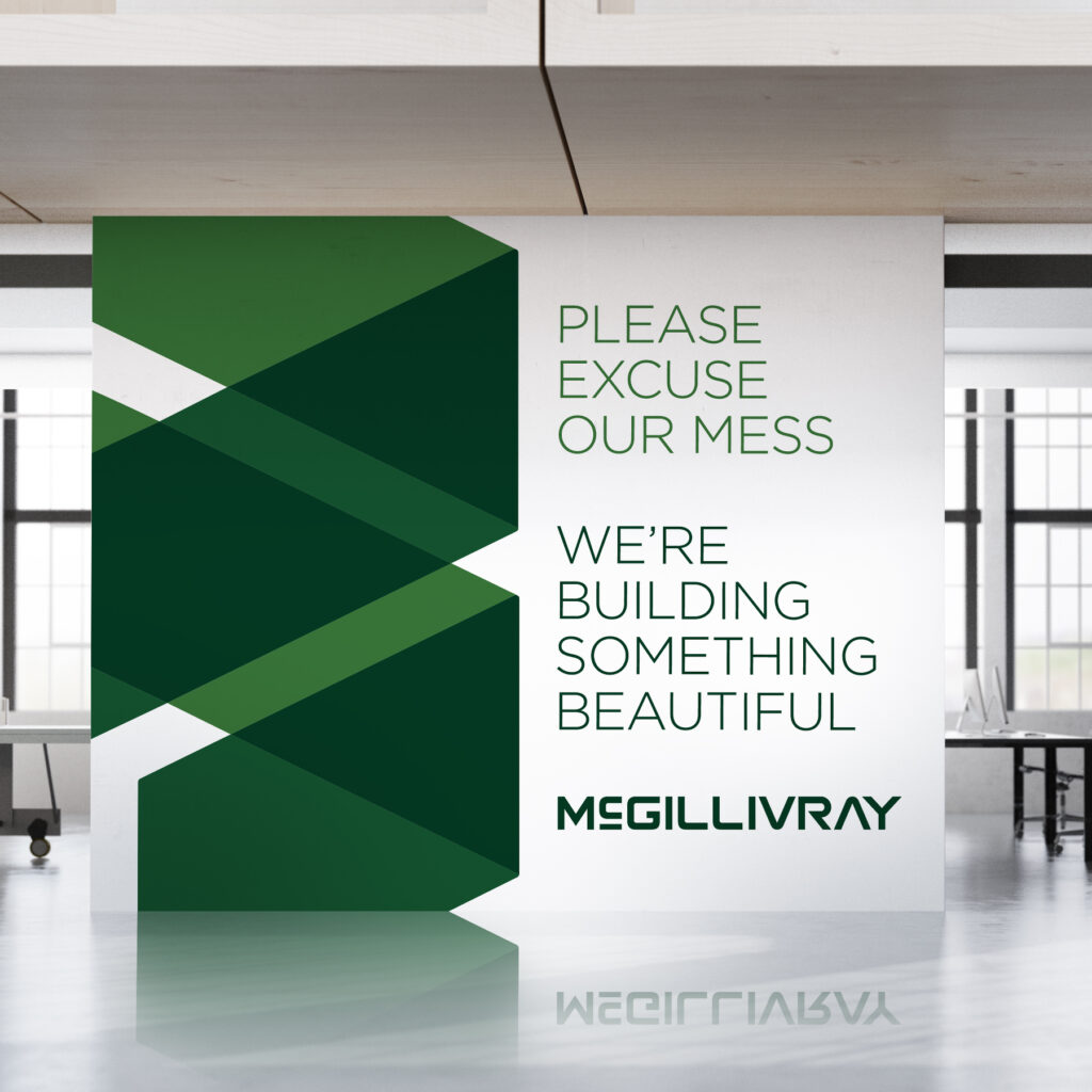
General contractors tend to brand their company by using their own last name, merging their own identity with that of their business. With this in mind, I worked with Steve McGillivray to create a brand that he felt proud to put his name on. After a prior attempt at rebranding left the McGillivray brand looking generic and indistinguishable from other contractors in town, Steve was hesitant to try again so soon. But we made a plan to go back to what he loved most about his brand from the beginning.
We kept his last name in its entirety and stylized it in a way that felt solid and substantial, but also modern. We chose to return to the all green natural color palette and expanded it to include darker shades for better contrast and visibility. The logo mark itself was designed to represent building blocks actively being stacked on top of one another, as if you’re watching the logo being built. This “corner stone” being formed by simple geometric shapes communicates a strong, well-built foundation which is the key to any successful construction project.
Eventually Steve returned to develop a refreshed website that aligned with their new brand identity.
Logo and business card design for Folsom Street Chains, a local artist made line of recycled leather and chains for you and your plants inspired by Folsom Street in San Francisco, California.
Kaity came to me with a name and a Pinterest board full of inspiration from her and her business partners. Their goal was to open a small studio where they would teach knitting, sewing, and other crafty classes in a workshop setting. We wanted to keep the brand bright and modern, with a playful color palette that reflected their quirky personalities.